17 Best React UI Libraries You must know in 2025

AK
Sep 23, 2025 • 10 min read
If you’re starting a new project in React, one of the first questions you’ll ask yourself is:
👉 “Which UI library should I use?”
It’s a deceptively hard choice. Pick the wrong one, and you’ll spend weeks fighting against opinionated styles or missing components. Pick the right one, and you’ll ship features faster, with cleaner code and a better developer experience.
The problem? There isn’t a single “best React UI library” for everyone. Some are built for speed, some for customization, and others for scalability. Indie hackers, startup founders, and teams all have different needs, but the library you choose will shape your entire workflow.
In this guide, we’ll cut through the noise and break down the best React UI libraries in 2025, what makes them stand out, and how to choose the one that fits your project.
What is a React UI Library? (For Developers New to the Game)
When you’re building a React app, you could technically write every button, input, modal, and table from scratch. But that’s reinventing the wheel, and it slows you down.
A React UI library is basically a collection of pre-built, reusable components (buttons, forms, navigation bars, modals, data tables, etc.) designed specifically for React applications. Instead of coding everything manually, you can import these components, customize them, and focus on building your actual product.
Think of it like this:
| Without a UI Library | With a UI Library |
|---|---|
| Write CSS for every button | Import <Button> and tweak props |
| Build modal logic from scratch | Use <Modal> with built-in accessibility |
| Style forms manually | Use ready-to-go <Form> with validation helpers |
| Weeks spent on UI boilerplate | Days spent shipping actual features |
A good React component library gives you:
- Speed → Faster development, less boilerplate
- Consistency → Unified look and feel across your app
- Accessibility → Many libraries bake in ARIA roles and keyboard navigation
- Customization → Options to match your brand or product design
For indie hackers or startup founders, this is huge. Instead of obsessing over pixel-perfect buttons, you can ship faster, test your idea, and iterate, while still having a professional-looking product.
Best React UI Library - Comprehensive List
Let's get started with the best React UI Component library that includes free and premium.
Blueprint UI – Enterprise-focused React components for data-heavy apps
Blueprint UI is a React toolkit designed for building complex, data-intensive interfaces like dashboards and admin panels. It’s optimized for developers who need tables, forms, and interactive components out of the box.
Built by Palantir, Blueprint UI emphasizes consistency, accessibility, and TypeScript support. Its components are ideal for desktop-first applications where performance and reliability matter most.
Features
- An extensive set of prebuilt components: tables, forms, modals, date pickers.
- TypeScript-first with strong type safety.
- Accessible with ARIA roles baked in.
- Focused on desktop and data-heavy applications.
Pricing
- Free (Open Source)
Cons
- Not mobile-first.
- Can feel heavy for lightweight apps or MVPs.
Evergreen – Flexible, modern React components for web apps
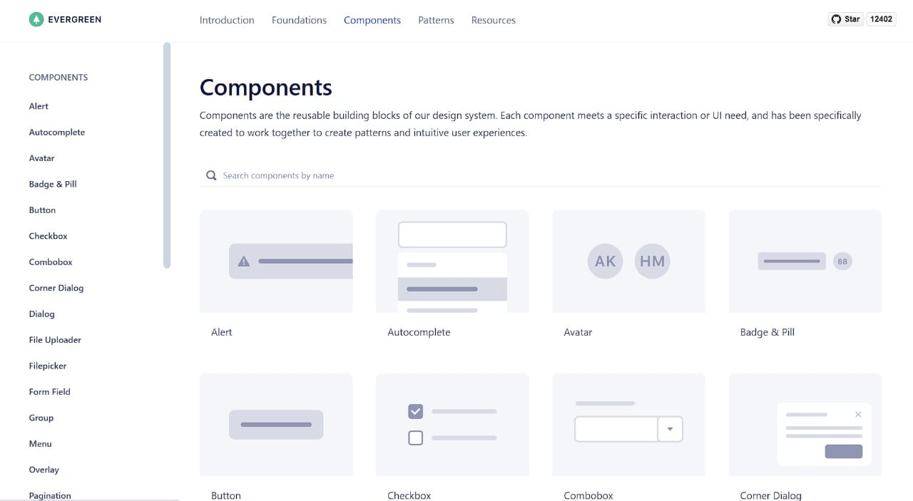
Evergreen is a React UI library by Segment, built for modern web apps that need simplicity and composability. Developers can ship clean interfaces quickly with minimal setup.
Its focus is on developer experience, providing theming, responsive layouts, and well-documented components. Evergreen works well for SaaS products, internal tools, and MVPs that need a professional look fast.
Features
- Clean and flexible UI components.
- Theming and responsive design support.
- Lightweight and easy to integrate.
- Active documentation with examples for developers.
Pricing
- Free (Open Source)
Cons
- Smaller community compared to Material-UI or Ant Design.
- Some components require additional customization for complex needs.
If you’re looking to launch a new SaaS or test a startup idea, we can help you build your next MVP in just two weeks, fully functional, scalable, and production-ready.
Grommet – Accessible and responsive UI components for React
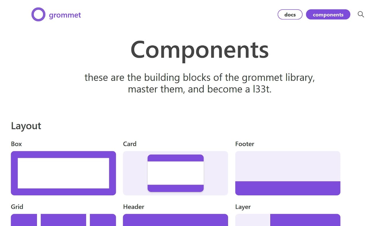
Grommet is a React library focused on accessibility and responsive design, making it ideal for apps that need to work seamlessly across devices. It’s built to help developers create visually appealing interfaces without reinventing the wheel.
It comes with a flexible theming system and prebuilt components for buttons, forms, grids, and charts. Grommet is great for MVPs and production apps where developer speed and accessibility matter.
Features
- Fully responsive and mobile-first components.
- Built-in accessibility and ARIA support.
- Customizable themes and styling.
- Prebuilt layouts and grid system.
Pricing
- Free (Open Source)
Cons
- Smaller community than Material-UI or Ant Design.
- Styling can feel opinionated for highly custom designs.
PrimeReact – Feature-rich components
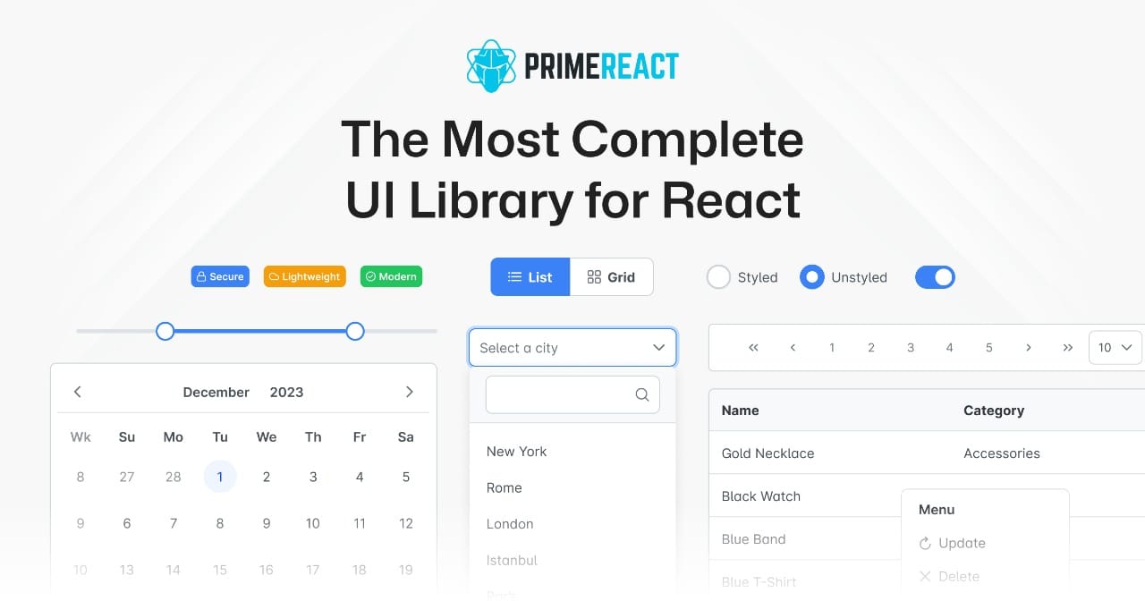
PrimeReact offers a comprehensive set of React components, including data tables, charts, forms, and more. It’s designed for developers building enterprise-grade apps or dashboards with a polished look and rich functionality.
The library supports theming, accessibility, and RTL layouts. Its component variety and advanced widgets make it suitable for complex web applications where out-of-the-box solutions save time.
Features
- 80+ UI components including tables, charts, and forms.
- Theme support with customization options.
- Accessibility-ready components.
- Active community and professional support available.
Pricing
- Free for open source usage, Premium themes available
Cons
- Can be heavy for simple projects.
- Slightly steeper learning curve for beginners.
Headless UI – Unstyled, fully accessible UI primitives for React
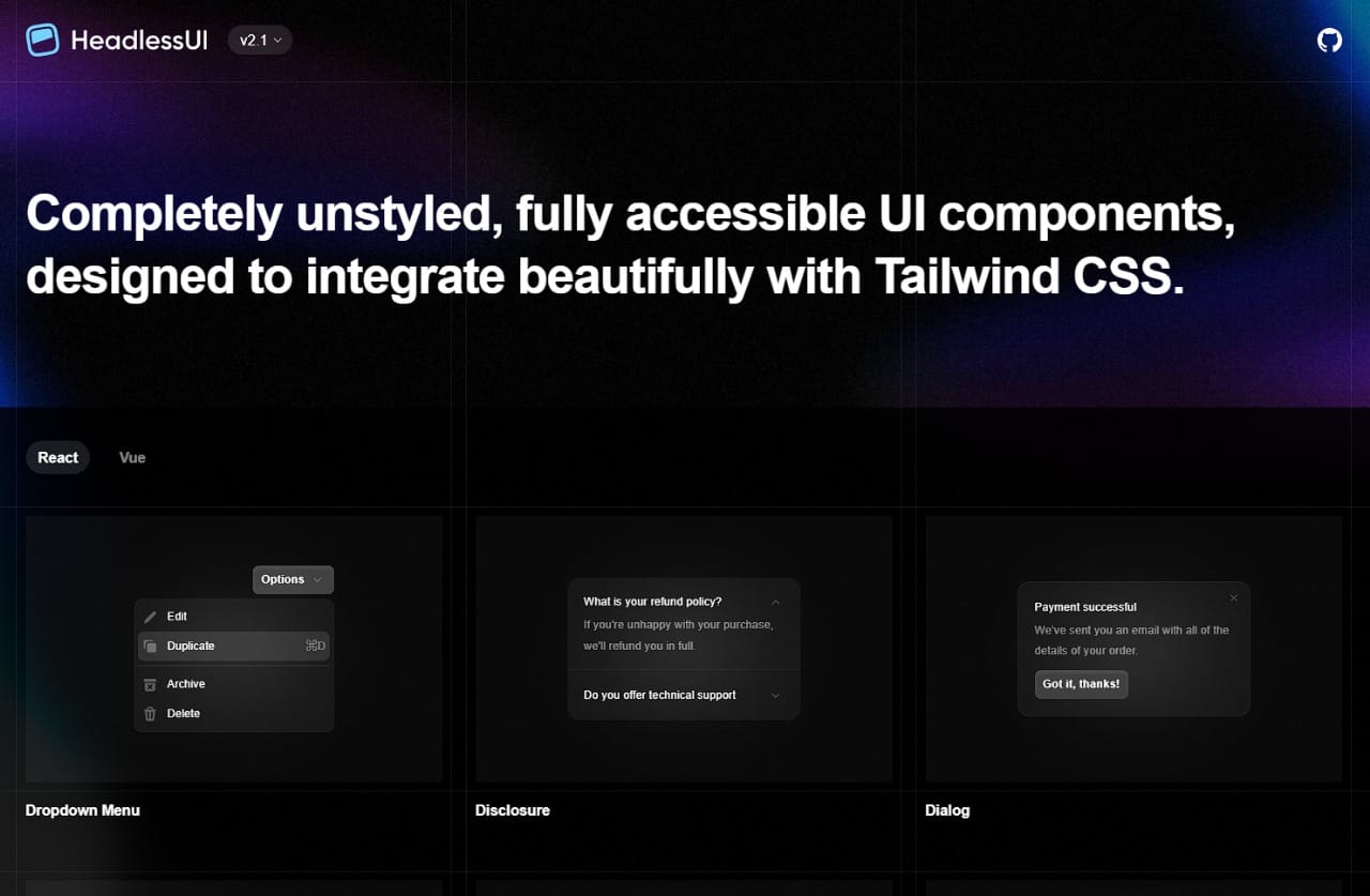
Headless UI provides completely unstyled, fully accessible components that give developers full control over design. It’s perfect for those who want custom UIs without fighting prebuilt styles.
Developers can combine Headless UI with TailwindCSS, shadcn/ui, or any custom styling system. It’s ideal for MVPs or production apps where design flexibility and accessibility are top priorities.
Features
- Fully accessible with ARIA roles and keyboard navigation.
- Unstyled, giving full control over UI design.
- Integrates easily with TailwindCSS or other styling frameworks.
- Components include modals, menus, lists, tabs, and transitions.
Pricing
- Free (Open Source)
Cons
- Requires manual styling, no ready-to-use look.
- Limited number of primitives compared to full UI libraries.
Theme UI – Design system for React with styled-system support
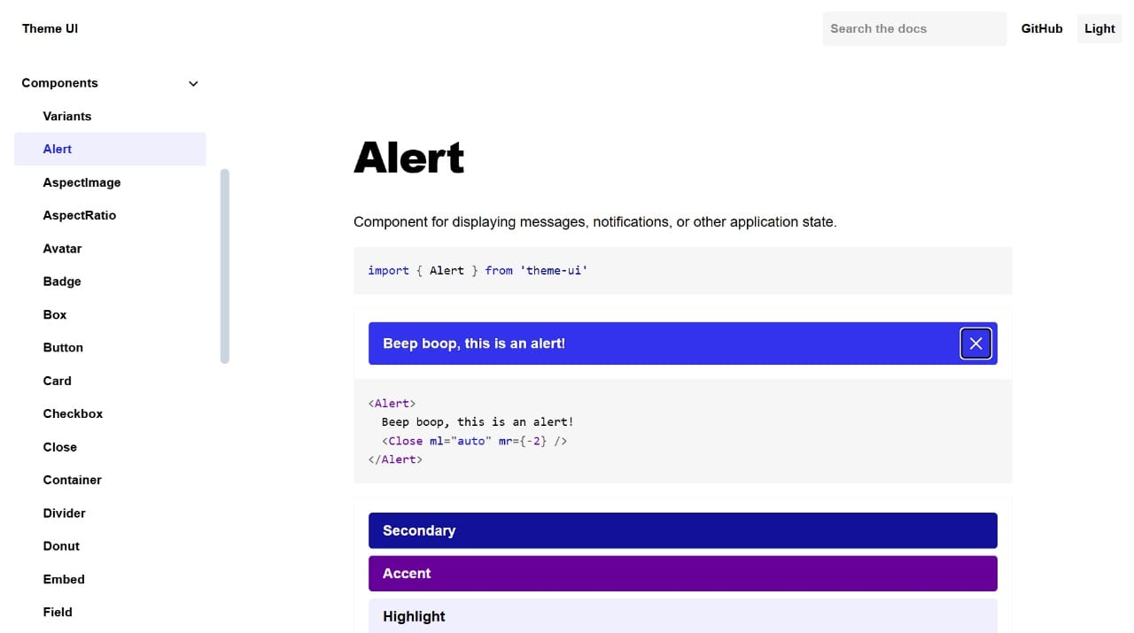
Theme UI is a React library for building scalable, themeable UI systems. It’s built on styled-system and is great for developers who want consistent design tokens and responsive layouts across apps.
It allows you to define typography, colors, spacing, and component variants in a single theme object. Theme UI shines in design-system-driven projects or products needing highly consistent branding.
Features
- Theming and design tokens for scalable UIs.
- Built on styled-system for responsive styling.
- Supports dark/light modes and custom component variants.
- Lightweight and flexible for custom designs.
Pricing
- Free (Open Source)
Cons
- Not a full component library, mostly style & layout helpers.
- Requires familiarity with styled-system for best results.
HeroUI (@heroui/react) – Lightweight, modern components for React

HeroUI is a minimalist React library designed for developers who need fast, clean, and accessible components without the bloat of large UI frameworks. It’s perfect for MVPs and startups that want modern interfaces quickly.
Components include buttons, forms, modals, and menus, all optimized for performance and developer flexibility. HeroUI is ideal for projects where speed, responsiveness, and simplicity are key.
Features
- Lightweight and modular component library.
- Accessible and mobile-first.
- Easy theming and customization.
- Simple API for fast development.
Pricing
- Free (Open Source)
Cons
- Smaller component set compared to full-featured libraries.
- Limited documentation and community support.
Mantine – Comprehensive React library with hooks and UI components
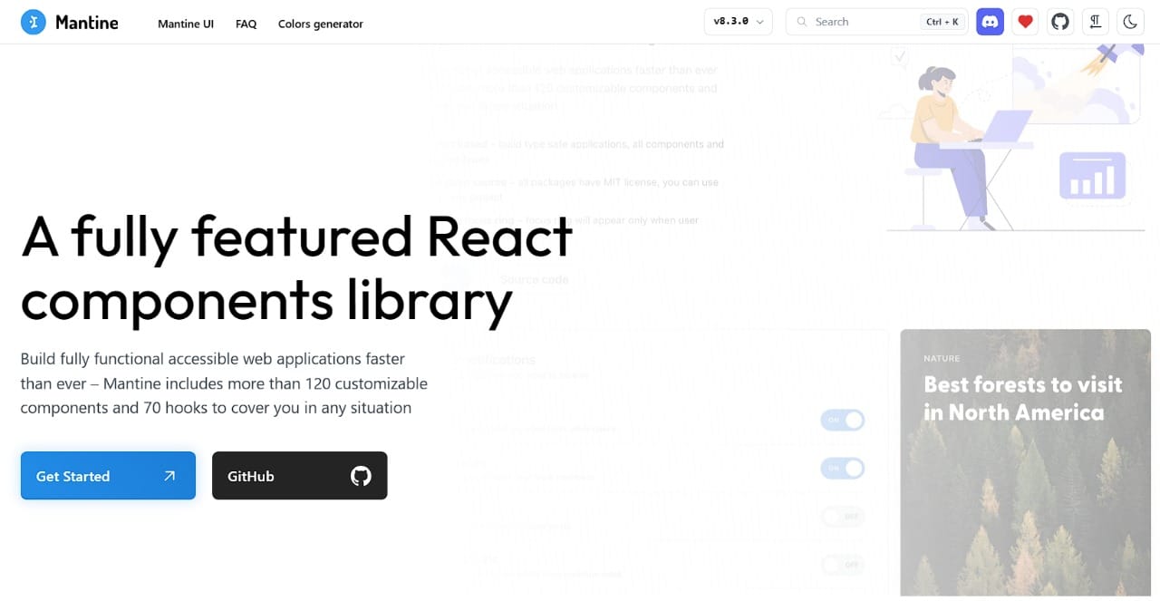
Mantine is a full-featured React library offering both components and hooks, designed for developers who want speed and flexibility in building interfaces.
It comes with over 100 components, rich theming, and advanced hooks for state management and forms. Mantine is excellent for MVPs, SaaS apps, and production-grade web applications.
Features
- 100+ components and hooks for forms, modals, and navigation.
- Theming with light/dark modes.
- TypeScript support with fully typed components.
- Accessible and responsive out-of-the-box.
Pricing
- Free (Open Source)
Cons
- Slightly larger bundle size due to extensive component set.
- Some components may be overkill for simple projects.
Radix UI – Accessible, unstyled components for modern React apps
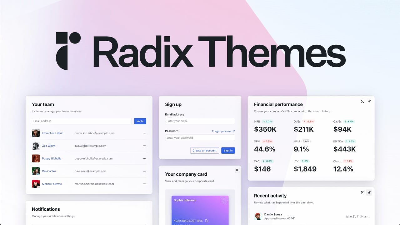
Radix UI is perfect if you’re looking for what is the best UI library for React that gives you full control over design without sacrificing accessibility. Its unstyled primitives let developers build custom UIs quickly while following best accessibility practices.
Radix provides low-level components like dialogs, popovers, sliders, and menus. It’s ideal for MVPs or production apps where a clean, custom interface and consistent developer experience are priorities.
Features
- Fully accessible components with ARIA support.
- Unstyled primitives for custom design systems.
- TypeScript-ready with strong typing.
- Works seamlessly with styling frameworks like TailwindCSS.
Pricing
- Free (Open Source)
Cons
- Requires manual styling, not ready-to-use UI.
- Limited number of primitives compared to full libraries.
Core UI – Enterprise-ready components for React applications
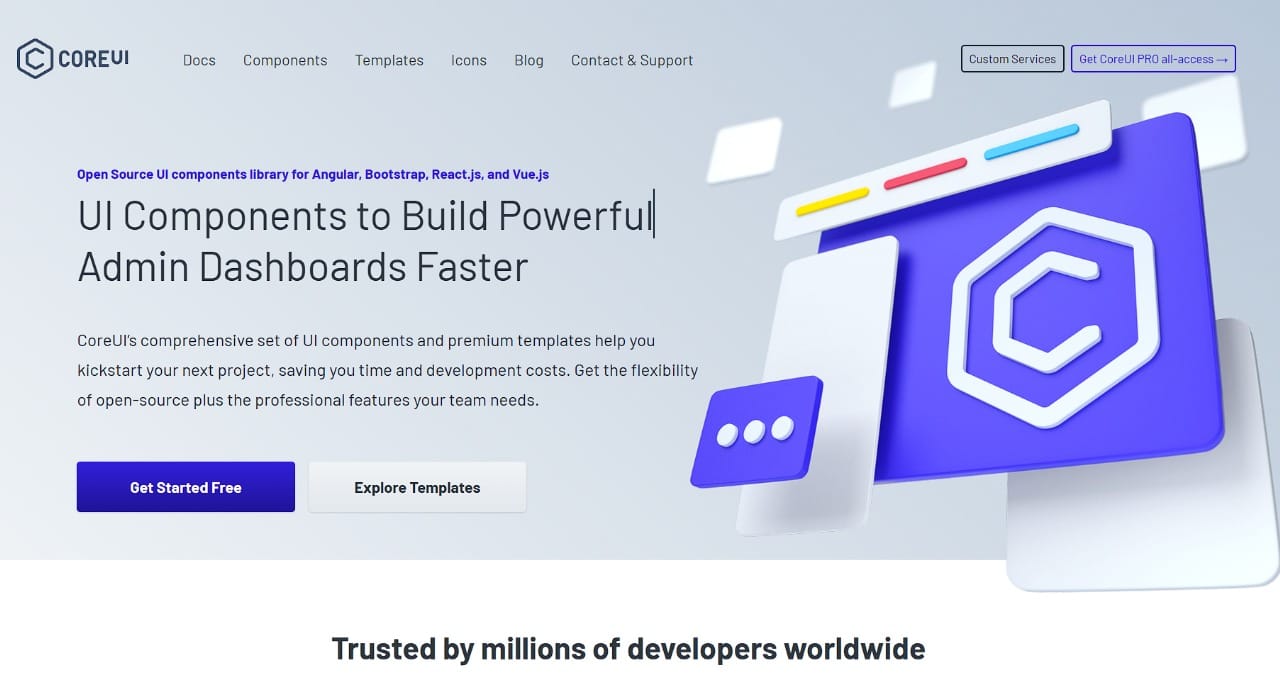
Core UI is a full-featured React library focused on building dashboard and admin interfaces quickly. It’s ideal for developers who want prebuilt components with consistent design and enterprise-level functionality.
It comes with components like charts, tables, modals, and forms, all designed for fast integration. Core UI is perfect for SaaS apps, internal tools, and MVPs where speed and consistency are important.
Features
- Extensive set of UI components including charts and forms.
- Responsive and accessible out-of-the-box.
- Built-in templates for dashboards and admin panels.
- Active community and documentation.
Pricing
- Free (Open Source)
Cons
- Slightly heavier bundle size for simple apps.
- Not as flexible for highly custom designs.
Reactstrap – Bootstrap-powered UI library for React
Reactstrap is ideal if you’re exploring the best React UI libraries for projects that rely on Bootstrap-based design systems. It gives developers access to Bootstrap components as React components, making integration seamless.
It works well for MVPs, internal tools, and startups that need responsive, consistent components without writing custom CSS. Reactstrap simplifies UI development while keeping apps lightweight.
Features
- All Bootstrap 5 components available as React components.
- Fully responsive and mobile-first.
- Lightweight and easy to integrate.
- Works well with existing Bootstrap themes.
Pricing
- Free (Open Source)
Cons
- Limited to Bootstrap styling.
- Not ideal for highly custom or unique UI designs.
Shards React – Minimalist and modern UI components for React
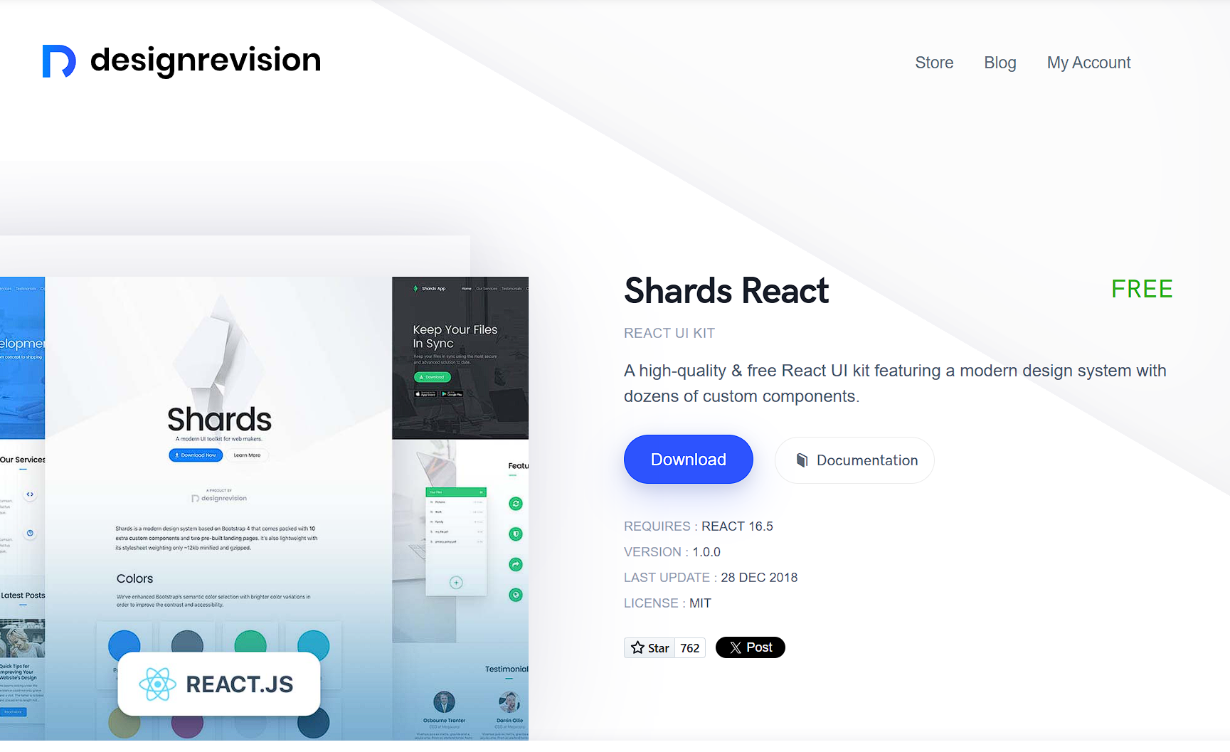
Shards React is a lightweight React library that provides modern, responsive components for developers building fast web apps. It’s perfect for MVPs and startups that need clean, production-ready UI without heavy dependencies.
It includes buttons, forms, cards, modals, and navigation components, all designed for quick setup. Shards React is great for projects where simplicity, speed, and developer experience matter.
Features
- Lightweight and modular component set.
- Fully responsive and mobile-first.
- Easy to customize with themes and props.
- Minimal bundle size for faster loading.
Pricing
- Free (Open Source)
Cons
- Smaller community and fewer components than larger libraries.
- Limited prebuilt templates or advanced widgets.
shadcn/ui – Highly customizable, Tailwind-based React components
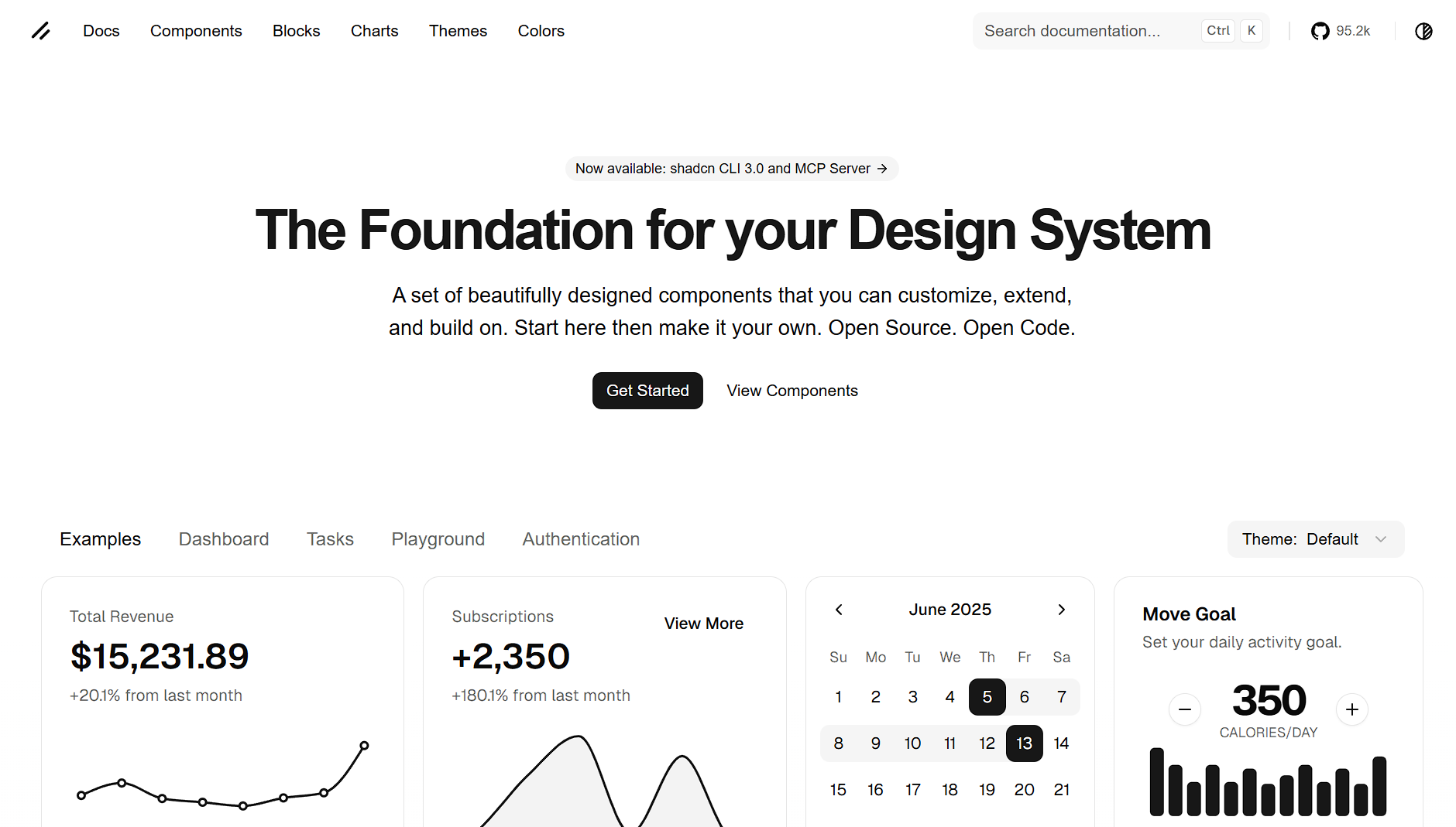
shadcn/ui is perfect if you want the best UI library for React JS that leverages TailwindCSS and provides fully composable, accessible components. It’s ideal for developers who want rapidly deployable, custom-styled UI for production apps or MVPs.
It offers unstyled primitives, fully customizable variants, and strong TypeScript support. shadcn/ui works well for developers building SaaS apps or startups that prioritize design consistency and modern styling.
Features
- TailwindCSS-based components for easy customization.
- Fully accessible with ARIA roles.
- Composable and modular for custom design systems.
- TypeScript-first for robust development.
Pricing
- Free (Open Source)
Cons
- Requires TailwindCSS knowledge for full use.
- Not a pre-styled, plug-and-play library.
Ariakit – Low-level, accessible primitives for React developers
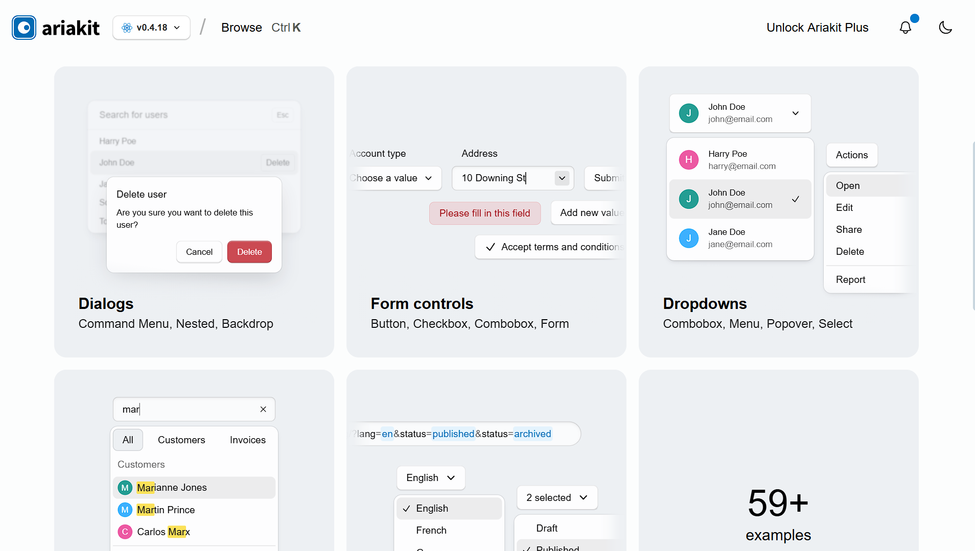
Ariakit is a great option if you’re looking for the best React UI libraries for building fully custom, accessible components. It provides unstyled primitives that developers can compose into their own UI systems.
It’s ideal for developers who want complete control over styling and behavior while maintaining accessibility standards. Ariakit works well for MVPs, SaaS apps, and projects requiring custom design systems.
Features
- Fully accessible primitives with ARIA support.
- Composable components for building custom UI.
- TypeScript-friendly for robust development.
- Lightweight and performant.
Pricing
- Free (Open Source)
Cons
- Requires custom styling, not ready-to-use UI.
- Smaller ecosystem than major libraries like Material-UI.
Conclusion – Pick the Right React UI Library for Your Project
Choosing the right React UI library isn’t about following trends, it’s about matching the library to your project’s needs, your team’s workflow, and the level of customization you require. Some libraries like Blueprint UI or Core UI excel in data-heavy dashboards, while others like Headless UI, Radix UI, or shadcn/ui give you full design control with unstyled primitives.
For MVPs or fast-moving startups, lightweight and flexible libraries like Mantine, Evergreen, or Next UI let you ship features quickly without fighting the framework. If your priority is enterprise-ready components and robust documentation, libraries like Fluent UI or PrimeReact are hard to beat.
Ultimately, it’s about developer experience: pick a library that lets you write less boilerplate, maintain clean code, and iterate fast. Experiment with a few options in a sandbox project before committing, your choice will shape your app’s UI, accessibility, and scalability for months to come.
Pro tip: Don’t just pick the “popular” library, pick the one that aligns with your tech stack, design goals, and developer comfort. Faster shipping + maintainable code = happier dev life.